Every year around this time, just before Apple unveils the latest versions of their operating systems at their annual developer conference, I like to re-evaluate whether or not I can use my iPad to get work done.
The iPad Pro is really a perfect portable machine. It’s small, insanely light, and easy to use in almost any situation — even tight plane seats. You can even get a cellular-equipped iPad if you want consistent and reliable internet when you’re away from a wifi connection. (And the new Magic Keyboard is a wonder.)
I really like using my iPad, and I always wish I could use it to get more work done. And every year, I ask the same question: can I use it as a laptop yet? Can it be my only portable device?
There are a lot of people I know, follow, and admire who use the iPad as their only machine, or as their dedicated portable device. I trust each of these people; they each represent a different class of person who is well-suited by the iPad’s strengths. They are writers, photographers, and entrepreneurs. The iPad is great for those people.
Writers are blessed with the iPad. There are more writing apps for the iPad than I could count. It is the best writing device I have ever used.
Photographers can almost complete their whole workflow on an iPad. With apps like Affinity Photo, Photoshop, and Lightroom on the iPad (and the USB‑C connection on the latest iPad Pros), it’s never been easier to use the iPad for photography[^1].
And for entrepreneurs, it’s easier than ever to use the iPad as your only computer. It’s great for project management and email, and the cellular model makes it easy to manage your business anywhere.
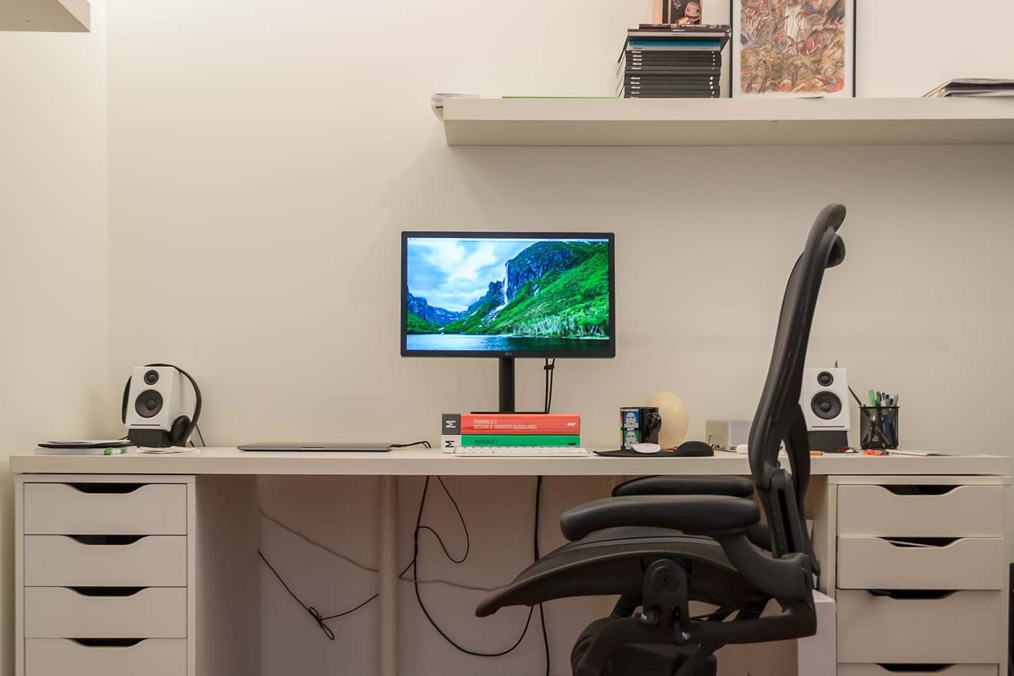
For many people, the iPad is all they’ll ever need. But I am a designer, photographer, and writer who codes websites. This adds several wrinkles to this setup.
Somehow, the iPad is ten years old, and there still isn’t a great web design app available. Sketch and Figma are noticeably absent from the App Store, and Adobe seems uninterested in porting XD to the iPad.
On that note, we don’t have any great print design apps either. InDesign does not exist for the iPad. (I use InDesign on my Macs all the time.) Its competition, as limited as it is, isn’t on the iPad either. Publication design and professional page layout on the iPad is a non-starter.
Even if InDesign or its competition arrived on the iPad, those apps require so many other simultaneous computing contexts that I’m not sure an iPad experience would ever be great. (I often have Photoshop, Finder, Illustrator, and InDesign open at the same time, all working on the same publication.)
Speaking of Photoshop: while you can edit photos with an iPad, I’m not sure anybody should manage them with it. The only DAM available for photography on the iPad is Lightroom. If you use Capture One, DxO, or any other alternatives, you can’t manage your photo library on the iPad. I’m currently a Lightroom user, but I don’t want to be bound to Adobe because of my hardware. (I’ve been considering Capture One for some time now.)
This isn’t necessarily about avoiding Adobe’s subscription fees. I am happy to pay for the tools I use to make a living. But as a working professional, I don’t want one option from one company. Competition breeds creativity and makes all the tools better. Philosophically, I don’t want Adobe to ever be the only option.
Finally, it’s also difficult to get web development done on an iPad. It’s not impossible, but without a desktop-class web inspector, and without local virtual machines or code compilers, the job becomes an arduous series of gotchas. (And the “desktop-class Safari” on iPad works until it doesn’t. Without hover states or anything else we take for granted on a PC, the internet is a lot harder to use.)
Most people do not have jobs with requirements like mine. I’m sure many people can use an iPad every day for all their computing needs. And I’m sure there are some people in my situation who choose an iPad, and jump through its hurdles to use what is admittedly a more tactile device.
But I just want to get work done.
The real problems are edge cases. Many small tasks take much more effort on an iPad than they do a Mac.
The other day, I made some quick edits to a Markdown document for a client. I needed to export the document as rich text and attach it to an email. This takes two clicks on my Mac; on an iPad, I had to fumble around for a few minutes until I got it done.
My sister is a teacher. If she needs a new machine, she could very well use an iPad. However, if the website she uses to track student attendance and report grades doesn’t work on Safari in iPadOS, then it’s moot. She won’t install iCab to get the job done. She’ll be rightly frustrated, return the iPad, and get a Mac instead.
I love my iPad. I genuinely like using it. I wrote this post as a way to talk myself into using the iPad more, but it slowly morphed. Here’s my basic problem, in a nutshell: if it’s faster to accomplish basic tasks with my laptop, I’d rather use that. I remain impressed by folks who use the iPad for their work every day, but for people like me, the iPad makes enough tradeoffs that I don’t think I could make the switch.
You can throw all the Magic Keyboards and Apple Pencils you want at this thing; it doesn’t make it any better at running the tools I need to get my job done.
[^1]: Because Lightroom CC relies on cloud storage, I’m not sure most professional photographers could rely on the iPad as their only computing device, but it can certainly be the mobile solution.