Posts about Apple

Weird product ideas for John Ternus

John Ternus is now in charge of Apple. While the iPhone Duo was undoubtedly started during Cook’s tenure, it sure sounds like his fingerprints were all over it. And it’s been interesting to see the coverage that he thinks Apple needs to try more things and move faster.

If I’m reading the tea leaves right (I’m probably not, but go with it), that means Apple might make weird stuff again. Like, say, a folding phone.

I have my own list of weird stuff I’d like Apple to make, and on the off chance that John Ternus is one of my small readers (he is not), I thought I’d share the list. I really want the first five or six. Everything after that is something I’d consider if I were the CEO (probably for the best I’m not).

  1. A Surface Studio-style Mac that allows to angle the monitor to a drafting table level so I can use the Pencil Pro on my desk. 
  2. Also add that feature to the Studio Display.
  3. A 32″ Studio Display XDR. You could call it Studio Display Ultra Pro Max. Investors will love that product synergy.
  4. An iPhone mini Pro with the high-end Pro camera system in a tiny phone. People used to write books on their iPhones before the Great Embigenning, which can be traced to the iPhone 6 and has never ceased.
  5. A MacBook Pro with cellular.
  6. Bring back the Mac Pro. Make it a loss leader. Maybe you only sell a thousand of them to a few AI developers, but Apple should have a halo Mac. Make an all new chip for it. The chip lineup becomes the MX, MX Pro, MX Max, MX Ultra, and MX Quadra. (Name pending.) This is the go-for-it computer; it’s the one that ever AI researcher wishes they could afford, and John Siracusa will somehow end up with two. Add in the ability to add discrete GPUs again and patch things up with Nvidia.
  7. Form a team who works exclusively on building relationships with video game developers. Make the tools those developers need, because you sure don’t now. Get more games on the Mac. Make porting games from macOS to iOS and iPadOS as easy as checking a box when submitting. 
  8. Make a mesh network router system. Seriously, you bolted a screen on to a Homepod before you thought to reintroduce a router?
  9. Completely rethink iPadOS. Just throw it out and start again. Work from Steve’s original vision: what can a tablet do that a laptop or a phone can’t? Right now, it’s a terrible Mac, and it’s only half as good a tablet as it could be. If you’re never going to add Terminal or let people build apps on the iPad, and it’s always going to be locked down, it’s time to turn it into an incredible tablet, and stop bolting on Mac features that it wasn’t designed for. (It’s Apple’s first Toaster Fridge, John, and that’s a reference.)
  10. Buy Sketch. I don’t know what you should do with Sketch, but it’s really weird that you own Pixelmator and Final Cut Pro, but not a design tool. I think there’s a lot of space left to innovate in design tools, and Apple could obviously benefit from owning the tool that they use for UI design. (Unless everybody at Apple still uses Keynote? In which case, congrats.) I’d love it if you could get Sketch on the iPad too. Let me draw my designs with an Apple Pencil. Turn my hideous drawings into high-fidelity UI, if you please.
  11. Put a nano-texture display option on the iPhone. 
  12. Make a fitness band that looks like the Livestrong armbands. Let it track your workouts and steps. Multiple vibrant colours. Stretchable rubber. $100. (Send me a cheque for this idea John. It’ll sell like hotcakes and it’s so obvious I can’t believe you haven’t done it.)
  13. Reboot the iPod Classic. Load up your own music or stream from Apple Music. Wifi, or wifi and cellular. Monochrome screen, no touch. Up to 256gb of storage is probably enough, since streaming can help reduce storage needs. Add in podcasts, and add the audio features Marco Arment popularized with Overcast to the app to make it the killer feature of this thing. This would probably be a dud, but I’m not a sentimental person, and I’d punch a penguin to get a functional Click Wheel back in my house. Plus, it’s almost retro enough to be cool with young people again.
  14. A foldable iPad. No outer screen. Just an iPad.
  15. Throw out the Music app on the Mac. Entirely discard it. Now build it again, but make it suck less. (Things to check: can you type more than one character into the search bar without breaking the app? Will audio output work every time you hit play, and not just some of the time? Do network connection interruptions mute audio playback entirely? Does music you add from Apple Music rot over time, with metadata seemingly fracturing and rotting under your fingers? I could go on. Things to add: let me easily browse albums. Let me view albums in a playlist, not just songs. When I view by artist, I want to see their albums in my library by release year, from oldest to newest, in a grid. I don’t want to see all the songs listed out.)
  16. Bring third-party app stores to iPhone. If your app store is so fantastic, let it compete.
  17. Let me install apps directly on my phone, like I can on a Mac. (If your app store is is so fantastic, let it compete. Is that an echo?)
  18. Make a cheese grater.

The iPhone Duo and Safari, continued

Here we go again. The webkit team writes about new iPhone Duo-specific features in Safari:

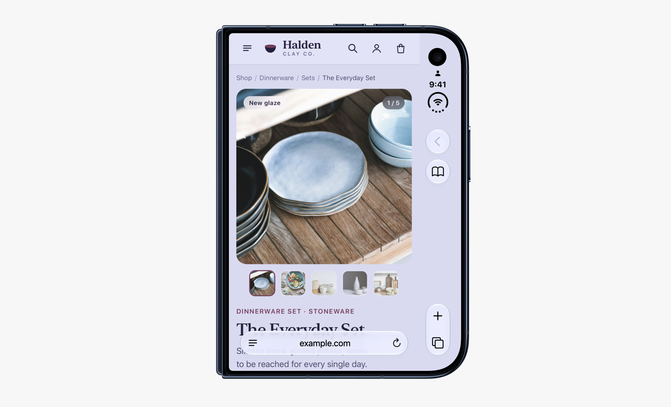
In Safari 27.1, web content does not currently extend to fill the space behind these controls. Just like on other platforms, Safari looks at the web page and extends its background color to fill the space.

We would like to give web designers and developers the ability to design and use that space in more creative ways. Perhaps you want to extend your header background across the full width of the display, for example. It might seem like there’s just one obvious way to make this possible, but really there are many possibilities.

Apple has done Safari users dirty for a while (see Liquid Glass, their terrible tab designs, etc). I use Safari day in and day out every day, and I do not love it anywhere. It’s not as bad of an app as Music on the Mac (which breaks my heart every day), but Safari hasn’t had a great UI for a couple years.

But this drives me nuts. Their image example of how bad Safari looks on the outer screen of a Duo is insane to me. I don’t know how they didn’t think to improve this in the many months before the Duo launched. (Maybe the Safari team was kept in the dark on the Duo. Who knows?)

It seems obvious to me that the answer is to use environment controls to solve this problem, but the Webkit people say this:

We could use the HTML viewport meta tag with viewport-fit="cover" to extend the webpage into that space, hoping developers also use the appropriate environment variables to scoot important content away from system controls. But as we research how today’s sites are built, we see a lot of projects that fail to inset all four edges correctly. 

A lot of projects fail to inset all four edges correctly because nobody has had a reason to before! This is like Apple saying, before the Duo released, that third-party iOS developers have shown no interest in making folding phone apps because they’ve never made them before. If you don’t give people a reason to use a tool, they won’t invest the effort. Web development is filled with enough landmines and gotchas as it is.

Also, the viewport sizes the Webkit shares for the Duo are very odd. Only 382 points wide in some cases! I haven’t seen a viewport that small since the last iPhone mini. If this thing takes off, which it appears to be, I’m going to end up needing one of these just for testing. (That’s an expensive test device. If your organization needs outside design help, hire me.) It’s such an unusual size that I imagine it’s going to be hard to simulate how Safari feels to use in the browser inspector. 

Jen Simmons is in charge of this, and you can share your thoughts on this with her on Bluesky or Mastodon

The iPod turns twenty-five

Twenty-five years ago, Apple released the iPod. Jason Snell has done the best writing on the topic, and covered the iPod for Macworld from its launch event to its eventual demise. He reflects on the iPod’s launch at Six Colors:

There are barely more than five years between the launch of the iPod and the launch of the iPhone. While both products took time to grow into their markets, I think it’s still the case that the true ​“iPod era” was only a handful of years long, and it’s been entirely overshadowed by the product that came after it.

That’s a shame, in a way, because I think people who didn’t live through this era don’t understand just what a hit the iPod was. It completely changed Apple’s fortunes, rehabbed its brand identity, gave people reasons to go into Apple’s relatively new retail stores for the first time, and taught Apple lessons that it needed to learn before it could build a smartphone. (The iPhone’s hardware was largely built by the iPod team, even if the software came from the Mac.

The iPod really hit the peak of its popularity when I was in high school. I can confirm that they were their own sort of Cool Currency. Every cool kid had one, or wanted one. If you had one, the music on them became a part of your personality. People wanted to scroll through your iPod and see what was on there. The music on your iPod was a second, deeper level of Cool Currency: were you into whatever was sick at the moment, or were you out?

It was normal to give one earbud to a friend and sit in the hallways during lunch, listening to each other’s music. That was how a lot of us discovered new music. Death Cab for Cutie and Arcade Fire spread through the iPods in my high school like viruses.

Those listening sessions were how I discovered music that was formative to my taste now. A friend introduced me to Slipknot with his iPod (it was ​“People = Sh”, as it’s known in search engines, and it amazed my little teenage mind and upset my parents). My guitar teacher introduced me to Metallica around the same time, and both of those bands changed the trajectory of my life in unexpected ways. 

Another friend introduced me to Nine Inch Nails (“The Hand That Feeds”), which ignited a love for industrial rock and metal, then a love for techno. Exposure to Trent Reznor would later lead me to David Fincher (see ​“Closer” appearing in Seven), which would help turn me into a lover of movies. Reznor also led me, like so many others, to Johnny Cash (you know the song — a cover so wildly powerful that Reznor has said the song is no longer his, but Johnny’s).

The iPod was how a bunch of kids in youth group snuck Jay‑Z and Eminem into their homes. No jewel cases necessary. It was my trojan house to counterculture. I mean, we torrented everything. Of course we did! It was high school in the early 2000s; we ripped off every record label under the sun. We didn’t think of it as stealing. Nobody even thought of it as piracy. To us, it was the same as burning each other discs, which we did all the time before the iPod came along. This was just more convenient, and a little more private. Besides, there was no iTunes Store at the time. Apple Music didn’t exist. How were a bunch of thirteen-year-olds supposed to afford a CD collection?

Our attitude was that, if you could never buy it in the first place, it wasn’t stealing. It was a license to enter the culture for ourselves and to make something ours, without having to ask for permission. Honestly, our blasé attitude towards piracy reminds me a lot about the ethical issues surrounding LLMs today. Even then, the world wasn’t prepared for how radically technology would challenge the law.


The iPod was also an introduction to the Mac — not just for the market, but for me.

For a lot of people, the iPod was what persuaded them to try out that other thing Apple makes — the iMac. As Jason points out, the iPod changed Apple’s fortunes forever. It had a tremendous ripple effect.

I know a couple people who started buying Macs after the iPod came out. One was my high school drama teacher, who put a bondi blue iMac in one of his classrooms. 

It was my first experience with a Mac. I just happened to sit at it one day to do some word processing. It wasn’t special. But it just made sense to me. Computers hadn’t made sense to me before, and yet, it felt like I intuitively knew how to use this one. Apple says this stuff a lot in their marketing, and I know it’s not true for many people, but for me, it seriously worked out.

I loved it so much I spent years convincing my parents to buy me a Mac. I talked about it so much they bought me my university laptop when I was in the twelfth grade, just to shut me up. I wore the plastic in that white MacBook down to the… well, down to whatever is beneath the plastic.

I didn’t live near an Apple Store. I don’t know how I would have experienced a Mac if it weren’t for that drama teacher in high school. And without the Mac, I would never have ​“discovered” design. I wouldn’t have my job.

I can directly trace or relate the iPod to my career, my passions for music and film, and much of the music I still love and enjoy today.

Long live the iPod.

(Jason Snell also wrote twenty-five things you might not know about the iPod for Tom’s Guide, which is also an excellent read.)

For the iPod’s 25th anniversary, Apple remade it on the web

For the twenty-fifth anniversary of the iPod, Apple recreated the entire device and its UI as the 404 page for Apple Music. (You will need to copy and paste that link into your web browser if you’re on an iPhone or iPad; it will open the Apple Music app otherwise.) 

The iPod recreation is extremely feature complete: it’s got music, artists, playlists, and yes, the games, all lovingly rendered on a monochrome display inside your browser window. And yes, the click wheel works with your grubby little thumbs the same way it did twenty-five years ago.

I’m particularly impressed with the music selections. This iPod comes virtually loaded with a selection of iPod-era classics. It’s a lot of pop punk and nü metal, among other things, including a host of Green Day, No Doubt, and even P.O.D.‘s ​“Youth of a Nation” (a song I hadn’t heard since I owned an iPod, if I’m being honest).

(Via Lex Friedman.)

iPhone Duo and Safari

An earlier draft of my initial thoughts on the iPhone Duo included a long note describing my curiosity about how Safari would feel and work on the Duo. It was growing too esoteric and wordy, and I wasn’t in the headspace to edit it for clarity, so I just deleted it.

Thankfully, my earlier questions — which were mostly about env(safe-area-inset) — are slowly getting answered. Mike Piontek writes about his disappointment in Safari on the iPhone Duo, and the situation looks pretty bleak. As in, this is the worst possible outcome.

Like Mike, if Apple insists that our designs should influence the browser chrome, I would like to control the browser chrome. I’d love to see his suggestions get adopted sooner rather than later, and they have solved this problem before with safe area insets.

Lighter MacBook Pros

For something like a year, there have been rumours going around about the new touch-based OLED MacBook Pros. 

The rumour that had me most skeptical was one about being thinner and lighter than previous generations.

I really want lighter MacBook Pros. Anything we can do to maintain their power envelope while making them smaller is a big win. My 16″ MacBook Pro is a tank, while 5lb isn’t enormously heavy, it definitely adds up in a bag. (From my recent experiences, I can tell you it adds up more when you’re carrying a laptop bag, a car seat, and a 13lb 6‑week-old baby too).

I was an early adopter of the disastrously thin and light MacBook Pros with the world’s worst keyboards. I went through a bunch of those as a sort-of unpaid QA tester for the world’s largest company. It was not great. Eventually, I gave up and bought an iMac Pro instead, because getting work done was more important than being portable.

The current MacBook Pro generation is a wonderful design and was a great course correction. Making them smaller and lighter again sounds like a terrible idea.

So I’ve been nervously waiting for more information about that with baited breath.

From the same Bloomberg article about Ternus taking charge of design at Apple (which I also wrote about) comes this juicy new tidbit about new laptop designs:

The new MacBook Pros are lighter — significantly lighter. Apple has reengineered the machine’s interior, miniaturizing parts and rearranging components to make the computer much easier to carry. The current 16-inch MacBook Pro weighs as much as 4.8 pounds, compared with 3.3 pounds for the 15-inch MacBook Air, so any meaningful reduction would be immediately noticeable. I expect these machines, currently in testing with macOS 27.2, to arrive by next month.

I will not be a guinea pig for this design. I’m not buying one in 2026. (Maybe 2027 with a new studio budget, but we’ll have to see.) 

However, this sounds like good news! Making a laptop thinner and lighter without making dramatic changes to the rest of the machine is a terrible idea. Making a laptop thinner and lighter because your chips are all smaller now at 2nm and you’ve miniaturized and rearranged the other components? That sounds like it could work. 

I’m hopeful that this machine doesn’t throttle, burn my legs, or ship with a stupid busted garbage keyboard made by imps from hell. But I’ll let other people test it.

My current laptop is an M4 Max and still has lots of life in it. A few things I would consider upgrading for:

  1. If the touchscreen lets me work in something like Concepts on my Mac (where I do all my early exploration for work), that would be incredible.
  2. If the laptop were lighter while maintaining or exceeding current sustained performance, and maintaining or improving current battery life, that’s a must.
  3. Cellular. Please. Please add cellular. My home network is so fast (3.5gb/s symmetric) that leaving the house and using somebody else’s network is painful. And on top of that, the networks at my favourite coffee shops and libraries just don’t work reliably at all, leaving me to hotspot to my phone. And when I hotspot to my phone, I run into bizarre issues with Docker, DDEV, AWS, and Imgix while working on local development. Having cellular built into the laptop would resolve a lot of pain points for me.
  4. If they, at the very least, keep the ports we have. HDMI takes up a lot of space, but I end up using it in conference rooms all the time. You know what’s annoying? Bringing the USB‑C to HDMI dongle. I’ve lost a lot of those.
  5. 128gb of RAM. I bought 64gb on this machine a year and a half ago to save a couple hundred bucks. In the face of current RAM pricing, it’s important that I share this publicly: that was stupid. I should have bit the darn bullet; I could always use more RAM. (Currently I have 24GB in swap, and it’s a Sunday afternoon; I’m not even working.)

The nano-texture screen is so great on my current laptop, and the mini LED design works so well for me, that I’m not even sure OLED would make a difference in my workflow. While I’m a big fan of OLED and have the biggest OLED TV I could buy in my home theatre, I don’t need it on a laptop.

But there are other things I would like to have. I am very much looking forward to the October event.

Apple’s John Ternus has found a new design chief: himself

From Bloomberg: Apple’s John Ternus Has Found a New Design Chief: Himself:

[The design arrangement] changed when Williams retired last year. Although Cook announced in a press release that the design teams would report directly to him after Williams’ departure — and that was true on paper — they actually began answering to Ternus. Cook gave him responsibility for design as part of the eventual transition to CEO. During the CEO transition period between April and September, Apple’s design leaders were effectively Ternus’ only direct reports before Cook stepped down.

Ternus already had some involvement with the design studio as Apple’s head of hardware engineering, given the close coordination required between the two functions. Since becoming CEO, however, he has immersed himself in the industrial design and human interface teams. Several people familiar with the department say he works hands-on in the studio several times a week, sometimes visiting multiple times in a single day.

Steve Jobs, of course, was known for taking a similarly direct approach to design while working with Ive. But Ternus’ involvement marks a major shift from the Cook era. Designers say Cook typically visited the studio for about an hour once a month, at most.

… With Ternus making design a major priority and taking such an active role in the department, it appears he has already chosen Apple’s new design leader and ultimate decision maker: himself.

Compared to Tim Cook, Ternus’ involvement is refreshing. Colour me intrigued. Cook was never much of a product guy, and there were times when the products suffered for it.

The comparison to Steve Jobs makes my eyes roll into the back of my head a little bit. We need to stop comparing every tech CEO to Steve. Only Steve could be Steve.

One thing that Steve had was taste, and he had it in spades. It remains to be seen if Ternus has taste. It sounds like he took over in July last year, presumably when the new Liquid Glass designs were already wrapped. So I’m encouraged to see Liquid Glass get a little better this year. All their changes have pushed it a little closer to the Aqua designs of yore, and it’s a massive improvement over all.

I also think Ternus is a good speaker and a smart (and shrewd) guy, and it comes across like he knows his stuff. In a couple interviews with Tom’s Guide and TechRadar, Ternus speaks clearly and intelligently about his team’s products.

But clearly Ternus is stuck between a rock and a hard place. He was a known Mac Pro apologist at one point. He understands the Mac. If he doesn’t like Liquid Glass on the Mac, I wouldn’t be surprised.

But as CEO, he as conflicting priorities:

  1. Apple’s pride and hubris forbids it from admitting mistakes and rolling back a design. So we need to wait until the next full redesign in a few years to see if Ternus has the goods.
  2. Ternus might be a product guy, but he’s also a corporate CEO, and he knows the iPhone is where the juice is. What’s good for iPhone is good for Mac, from that perspective, so maybe Liquid Glass stays, even if it makes the platform a little worse.
  3. Money, money, money is the top priority for a CEO.

So fixing designs that old-school (read: old) people in the community don’t like is probably pretty low down his priority list.

All that to say, I don’t know what to think about this. It’s either very good news or very bad news, but it’s hard to imagine that a CEO spending hours a week guiding the designers is a neutral event with no consequences whatsover.

We’ll have to wait and see.

Initial thoughts on the iPhone Duo

I have two thoughts on the iPhone Duo.

First, I think the iPhone Duo is going to be a hit.

Second, It’s not for me. But I kind of want one anyway, partially out of curiosity and partially for work.

My prediction

As far as my prediction goes: I don’t think the Duo is going to be the best-selling iPhone this year. (I don’t think Apple could produce enough of them to make that happen, even if they wanted to.) But I do think it’s going to sell like hotcakes. I think they’re going to sell as many as they can make, and I think every folding phone will look like this within the next twelve months.

I’m 35 years old, and my friends, my parents and in-laws, and my friends’ parents are all talking about this phone. All of them are expressing skepticism: ​“Who on earth would want a folding phone? Why do you need that?”

I am well aware that anything invented after you’re 30 is basically from the devil and unnecessary, so I’m cognizant that this derision from the older generation likely indicates a hit.

A few other times I’ve heard similar sentiments in my lifetime from the same age range:

  • “This iPad thing. What a stupid name. And it’s just a big phone. What’s the point?”
  • “A phone without a keyboard is just dumb. Nobody wants this.”
  • “So you’re telling me people send text messages to the internet and it just posts on this Twitter thing. It’s 104 characters or something. What a joke. Nobody wants that.” (This remains my personal favourite; my father said it after he heard about Twitter on the radio one day circa 2007.)

As far as I’m concerned, ​“Who wants a folding phone?” has claim chowder written all over it.

In addition, I was at the Apple Store on Sunday for an unrelated errand and asked one of the employees if people seemed excited about the Duo, and he told me at least 50% of the people coming by were asking if they could see one. So yeah, people seem very interested.


My own thoughts

As for me, I think the form factor is smart, and the design team has clearly knocked it out of the park. I think people are going to love the matte display outdoors (I would love a nano texture option for my iPhone Pro). And I think people just love their iPhones, and given the option, always want a bigger iPhone.

I’ve been keeping a list of how often the bigger iPhone would have been handy since it was announced. My wife and I just celebrated the arrival of our firstborn. She’s six weeks old now. Until just a couple days ago, she wouldn’t sleep without being held, and I’m already a bit of a night owl, so I took the night shift. A larger single-handed device would have made this much better for me, as you can imagine.

But I don’t think the form factor is for me. To tell you the truth, I want a smaller phone, not a bigger one. My iPhone 17 Pro is already too wide for me. I don’t think my hands are particularly small or particularly large. They’re normal-sized hands for a male. And phones are getting too large for me to use with one hand, which is a problem.

I’d love the Mini form factor with the Pro camera system.

However, at some point, I think I’m going to test the Duo in an Apple Store. Depending how it feels to use, I might end up with one. Maybe not this year, and not as my primary phone. But if this thing takes off, it’ll be important to understand the form factor and how it feels for web browsing and apps. 

Safari on a Duo looks really weird.

The Apple Cards origin story

Lex Friedman writes about the origin story of Apple Cards, an app I had completely forgotten about. Turns out to be a very good piece of reporting and a great read:

In 2011, Mike said, ​“Steve Jobs was on one of his famous walks after having had a dinner with someone,” and he said to his walking companions from Apple, Mike was later told: ​“Wouldn’t it be great if I could just right now on my iPhone send [the dinner companion] a thank you card?”

Apple decided to build an iPhone app just for creating and mailing cards. And the project moved fast, because it was a Steve-initiated one. As it turns out, the app was built and launched during the final year of Steve’s life.

While I’m talking about Lex, let me also say that his new website covering Apple instead of AI is really, really great, and has already become something I look forward to reading in my RSS feed.

The ​“new” Safari is broken

I haven’t updated to Tahoe yet, but I did update Safari, and my word this version of Safari (on Sequoia) is unbearably slow. Using the URL bar is slow. Typing a URL or a search query is slow. Scrolling is almost broken.

Between this and the awful Safari design on iOS 26, I’m very close to making Chrome my default browser.

Does anybody know how to fix this? I tried updating to the Safari beta, which apparently has the fix, but it’s still entirely broken.

iOS, ICEBlock, and downloading apps outside the App Store

For years, it’s been obvious to me that Apple should open up the iPhone and let users download apps from the web. This week, after the ICEBlock drama in the United States (see John Gruber’s post), I wanted to add my voice to the chorus of many asking Apple to allow people to download apps from the web on iOS. As Jason Snell once wrote, the Mac is the model. He was right then, and he is more right now.

Regarding Liquid Glass

I really enjoyed Nick Heer’s review of iOS and macOS 26. I wish I wrote something as thoughtful; after my summer spent fighting Safari’s new design, I had a lot to say, but I never wrote it down.

The whole thing is worth reading, but I’ll highlight one section I particularly enjoyed. Nick writes about macOS here, but there are many apps in iOS and iPadOS where this same critique could be levied, including Safari. (The emphasis below is mine.)

The way toolbars and their buttons are displayed on MacOS is, at best, something to get used to, though I have tried and failed. Where there was once a solid area for tools has, in many apps, become a gradient with floating buttons. The gradient is both a fill and a progressive blur, which I think is unattractive.

This area is not very tall, which means a significant amount of the document encroaches into its lower half. In light mode, the background of a toolbar is white. The backgrounds of toolbar buttons are also white. Buttons are differentiated by nothing more than a diffuse shadow… the sum of this design language is the continued reduction of contrast in user interface elements to, I think, its detriment.

Apple justifies these decisions by saying its redesigned interfaces are ​“bringing greater focus to content”. I do not accept that explanation. Instead of placing tools in a distinct and separated area, they bleed into your document, thus gaining a similar level of importance as the document itself. … in my experience, the more the interface blends with what I am looking at, the less capable I am of ignoring it. Clarity and structure are sacrificed for the illusion of simplicity offered by a monochromatic haze of an interface.

Even if I bought that argument, I do not understand why it makes sense to make an application’s tools visually recede. While I am sometimes merely viewing a document, I am very often trying to do something to it. I want the most common actions I can take to be immediately obvious.

The passage I emphasized is the very same problem I have with the design, particularly as a designer. When the tools of the OS bleed into my document, particularly when designing a website, my design has to accommodate Apple’s UI, and that deeply frustrates me. 

But Nick also writes about something else vexing. Tools are now hidden in junk drawers, and often more difficult to find. Apple’s software is great graphic design, but it is becoming frustrating interface design. These are different practices, with different goals. Graphic design is intended to draw attention, often for the sake of branding or advertising. Interface design is not unlike designing a hammer: it is the practice of making a tool useful and usable. For Apple’s software to be a great piece of graphic design, but not a great interface design, is a dramatic failure of purpose.

Nick also asks why Apple feels the need to do this now:

Why is this the first time all of the operating systems are marketed with the same version number? And why did Apple decide this was the right time to make a dedicated ​“operating system” section on its website to show how it delivers a ​“more consistent experience” between devices? I have no evidence Apple would want to unify under some kind of ​“Apple OS” branding, but if Apple did want to make such a change, this feels like a very Apple‑y way to soft-launch it. After all, your devices already run specific versions of Safari and Siri without them needing to be called ​“Mac Safari” and ​“Watch Siri”. Just throwing that thought into the wind.

Stop giving them ideas, Nick.

Apple has worked to unify their designs for years, despite the cries from the design community that this is a fruitless idea. Large, multi-window operating systems like the Mac (and now the iPad) naturally demand different interfaces than a modal OS running in a device you hold in your hand. I don’t know why they did this now. I like Craig Hockenberry’s thoughts on this, where he posits that this all might be in preparation for a foldable phone, but I question anybody who thinks Apple plans that far ahead. I think Apple looks 12 – 24 months out at a time, like most organizations I’ve worked with. 

What I’ve pieced together from years of rumours is that Apple started this redesign process shortly after Ive departed. There was a rumour years ago that Apple was working on a design that embraced ​“neumorphism,” which is a word I never hoped to have to spell. 

What Apple ended up with isn’t exactly — look, don’t ask me to spell it again. But it’s not far off. Listen to the criticism of neumorphism, directly quoted from the Wikipedia page:

Neumorphism has received criticism from UI designers, notably for its lack of accessibility, difficulty in implementation, low contrast, and incompatibility with certain brands.

That sounds about like where we’re at to me. From Wikipedia’s Liquid Glass entry:

However, other users noted that certain elements were too transparent, making text difficult to read in low-contrast environments, such as direct sunlight. Designers interviewed by Wired felt that the visual effects distracted from app content. One designer said developers with smaller teams might struggle to meet the high visual standards set by the new interface.

Neumorphism and Liquid Glass are by no means identical, but one could argue they share the same etymology. Based on when neumorphism was trending (2022 and 2023), I’d wager they’ve been working on Liquid Glass for two years. I’d also wager they might have waited another year to ship this redesign, if it weren’t for the disaster that Apple Intelligence was for the company last year. They needed a win.

If Apple was working on this for at least two years, and it involved redesigning everything (including macOS), I’m not convinced it was for a foldable phone. I’m also unconvinced their plan is to make one unified operating system. If I worked at Apple, the major selling point of a cohesive design is a manageable component library. Every large platform I’ve worked on is obsessed with minimizing components across all their apps. Apple makes a lot of operating systems and need to avoid both design and engineering complexity. It is easiest to share parts where they can. 

I don’t think they have a plan. While a unified design library makes sense to me as a design practitioner, I am not certain it works in practice (particularly on macOS). As far as asthetics, I think Apple thinks design is partially fashion, and that they need to be a forward-thinking fashion house. They are not wrong. But is OS 26 forward-thinking or merely a façade? I suspect the latter, but only time will tell.

The current state of Apple’s external monitors

With rumours abounding about an updated Studio Display from Apple, this seems like a good time to review the state of Apple’s current slate of desktop monitors, and maybe compare the competition.

I have not kept secrets about how badly I want to buy Apple’s Pro Display XDR. That would be a terrible decision, because the display is practically ancient at this point. It’s a Mini LED display with over 500 dimming zones, but that number is paltry across its 32″ canvas. The MacBook Pros are also Mini LED, and the 16″ model — a quarter of the size of the Pro Display XDR — has over 2,500 dimming zones. 

I know specs aren’t everything, but basically, that’s a lot more lights, which means a lot more consistency in brightness across the display. 2,500 is five times more than 500, but it’s also in a quarter of the space, so a new Pro Display XDR would need 10,000 dimming zones to keep up. That’s twenty times more dimming zones than it has now.

The Pro Display XDR’s matte coating is also less effective than similar technology in the MacBook Pro line. In the MacBook Pro, the nano-texture coating is chemically etched, which is far more subtle than the physically etched coating on the Pro Display XDR. On my matte MacBook Pro, there is barely a perceptible loss in brightness or contrast. With the physically etched implementation on the Pro Display XDR (and Studio Display), I get a headache.

So the technology in the Pro Display XDR needs a rethink.

However, the Pro Display XDR is not rumoured to get a revision right now. Apple apparently only plans on updating the Studio Display next year. In my mind, the Pro Display XDR needs this revision much more than the Studio Display does. Apple could do nothing to the Studio Display for another five years and it would keep selling like hotcakes.

That’s because the Studio Display is a great monitor. It looks good on a desk, and despite the fact it’s ​“only” an IPS display, the colours and brightness are consistent across the entire panel (according to my calibration device). Competition is only now starting to catch up, with similar panels from ASUS and Samsung hitting the market this year. 

The Studio Display’s rumoured updates include Mini LED, which would be interesting because it would supplant the Pro Display XDR if it were done well. There are apparently two Studio Displays in testing at Apple. I have a few theories about this:

  1. One of them could be an iMac.
  2. The rumours could be right and this is Apple’s way of experimenting with production and doing a coin toss on which one to ship.
  3. My dream scenario: we’re getting back to 2004, an era when Apple shipped multiple monitors simultaneously, in different sizes but otherwise with similar specifications. I would love to see a revised Studio Display available in 27″ and 32″ sizes.

What I want is the Pro Display XDR. But the technology in that display has come down in price, and it seems reasonable that a panel with similar tech (and a more modern implementation of that tech) could be made for around the same price as the current Studio Display.

Historically speaking, top-of-the-line monitor tech from Apple works its way downstream, and then the top-of-the-line monitor disappears. (See the high-end Cinema Display becoming the affordable Thunderbolt Display somewhere around 2011.) So Maybe Apple plans on removing the Pro Display XDR from the lineup entirely. 

If Apple ships a 32″ Studio Display with 10,000 dimming zones next year, I will happily replace at least one of the two Studio Displays on my desk.

(It’s worth noting that ASUS just released a 32″ 6K display with similar technology to the current Studio Display. YouTubers have posted a couple reviews, and while the panel itself looks totally fine, I can’t imagine working with a flimsy, plastic thing on my desk. I have to stare at that thing all day. I would genuinely rather set money on fire and buy a new Pro Display XDR if I were forced to pick one.)

Love this Bondi Blue iMac made out of LEGO . If 10,000 people upvote it, LEGO will consider turning it into an actual product. Go vote!

I didn’t return my iPad Pro

Today, I get to eat a little crow: contrary to my publicly stated intentions, I did not return my iPad Pro. The short version is that my old iPad Pro more or less died on me. 

In my previous post, I wrote that I could do everything I needed on an iPad with pen and paper. The thing is, I didn’t inventory my work on iPadOS until after I wrote that post. (This was stupid of me.) That was when I thought to myself: ​“Shoot, I do a lot of iPad-only stuff when I’m working on wireframes.” I’ll frequently grab screenshots of apps and websites and place them alongside my sketches. I tend to iterate on ideas from left to right, duplicating old ideas, erasing what didn’t work, and sketching more (as though I were duplicating art boards in Figma). 

On top of that, a lot of my clients are long-term clients, and the work that I do months or years prior might (and has) become useful again, even if it were disregarded prior. I do not want to keep stacks of draft paper filed away for months or years at a time.

At that point, I made a decision: I still don’t need this new iPad, but I do need my old one.

So I booted up my 2017 10.5” iPad Pro, which I had previously formatted for trade-in, and set it up again. I had a bit of work to do, so once Freeform was ready, I got to it.

That was when I noticed the smell.

The iPad had this faint smell of burning plastic, but only when I held my face near it (which I tend do while drawing; please do not judge me and my weird habits). I’m no engineer, but I know that anything resembling the smell of fire in a battery-powered product was bad, so I shut the iPad down, and made a new plan.

Clearly, my 2017 iPad Pro was kicking the bucket.

So, in an effort to get the best bang for my buck and make the new one last, I would keep the 2024 iPad Pro, and trade in the 2017 iPad Pro.

A day or two later, I brought the 2017 iPad Pro to the Apple Store to trade it in. I explained what I just wrote, but the Apple Genius seemed nonplussed. ​“Does the device power on?” he asked. I said yes. ​“Does the screen work?” he asked. I said yes again. Finally, he asked if Touch ID worked and there were any large dents or scratches. I said yes and no, respectively, but I added that the battery only lasts an hour and may or may not be swelling. He again, said this wasn’t an issue and they would check all that during their diagnosis.

So he used whatever fancy tool Apple has for this, signed off on everything, and gave me a refund of $100 towards the 2024 iPad Pro (which felt pretty generous, all things considered).

Then he got me to wipe the 2017 iPad Pro, and something happened.

The iPad froze after I entered my password to disable Find My on the iPad. ​“Oh yeah, this happens all the time,” the Genius said. ​“On every product, not just iPads. iPhones and Macs all freeze here too. Don’t worry.” 

Then the iPad unceremoniously shut down. 

I asked if we should have seen an Apple logo with a loading indicator below it (we should have), and the Genius said yes. But then he added nonchalantly, ​“Who knows though? I’ll be back.”

He spent a few minutes helping other customers before he returned. My iPad still hadn’t rebooted.

“You said the battery doesn’t last, right?”

I said yes.

He took about thirty seconds to find a Lighting charger buried somewhere in the deep recesses of the store and plugged the iPad Pro in. It still didn’t turn on. 

The Genius’ brow furrowed. ​“I think your iPad is dead.” Seeing my immediate look of concern, he added, ​“but we already gave you the money for the trade in, so it’s our problem now.”

I spent another several minutes with him while he tried every troubleshooting method I knew of and a couple I didn’t. Eventually, the iPad rebooted long enough just long enough for us to see the iOS welcome screen. ​“There. Your data’s been wiped,” he confirmed. 

Then the screen turned off again as the iPad shut down, while plugged directly into an outlet.

And that, dear reader, is how my old iPad Pro died the moment after Apple gave me my trade-in value for it. As my father-in-law pointed out to me, it is rare in life for a system like that to work in your favour, so cherish it while it lasts.

I did, however, return the Magic Keyboard for iPad Pro, which only served to help me procrastinate on the iPad before returning to my Mac. I replaced it with the Smart Folio cover, which is totally fine.