I spent a bit of time last week comparing how SVGs render differently in Safari and Chrome when using CSS’s vector-effect, and shared my findings in my portfolio.
Posts about Web Dev
August 11, 2025
July 02, 2025
Give footnotes a spec
I use footnotes on this blog, but have often found them annoying to implement, write, and deal with, so I found Jake Archibald’s post on footnotes an interesting take on the matter:
If reproduced as-is, footnotes on the web are even worse than their printed counterparts. In print, the footnotes are usually at the bottom of the current page, so they’re a quick glance away, and you can use a finger to mark your place in the main text while you’re off on your side-quest. Whereas on this beautiful pageless web of ours, you have to scroll all the way down to the end of the article. You can try flinging right to the bottom of the document, but if there’s a sizeable footer or comments section, you’ll overshoot the footnotes. And of course, after all of this, you have to scroll back to where you were, which is easier said than done.
Jake suggests myriad ways to deal with this problem, most of which I’d already implemented, but none of them solve the root problems:
- Footnotes are less accessible, because they’re often set smaller than body text.
- On the printed page, footnotes can exist in the footer of any page. This makes them unobtrusive to read, since the size of a page is restricted by the physical limitations of books. Your eyes don’t have to travel far. On the web, no such luck: a webpage can be a mile long, so placing footers at the end of the document can turn footnotes into a very un-fun game.
The bigger problem in my mind is #2, and I’ve been contemplating solutions to this for some time.
On the web, I’ve often thought the best solution is using something similar to <aside> or <section role="notes"> in the way Jake describes. Ideally, each “footnote” would directly follow the paragraph it pertains to.
On desktop, these footnotes could be displayed in the margins of the page. (It’s called marginalia for a reason.) The smaller type can stay, mostly as a way to semantically highlight the insignificance of the footnote itself, which almost certainly exists for the author’s sake and not the reader’s. This works really well in Klim Type Co’s essays and case studies. (Unfortunately, Klim’s solution doesn’t scale down to mobile.)
I dislike the popup solution, which presents the user which a choice and annoys me personally as a reader. Popups are also annoying to build.
The problem with using <aside> or <section role=“notes”> is that these solutions are not part of any agreed-upon footnote spec. It’s scope creep if you’re building in most CMSs today, including (and probably especially) WordPress. They also don’t render as footnotes in RSS feeds, so your content will be presented differently there than it would be on a website. (One could replace marginalia with normal footnotes for RSS feeds, but again, scope creep.)
For now, one way around it is to use JavaScript to fetch the footnotes and display them inline as marginalia beside the text. I’ve never built this out, but I can imagine a few potential accessibility problems (in addition to the accessibility issues already present for footnotes).
The best solution, outside of abandoning footnotes altogether, is an HTML spec for footnotes that removes the need for each developer to suggest their own implementation. Whatever the spec is, it could incorporate a best-practices approach that allows for CSS styling to transform footnotes into marginalia, something similar to an <aside>, or even a popup. It would also, theoretically, solve accessibility problems that developers create with their own implementations.
For now, a better approach is probably to replace each footnote with a <section role=“note”>, which is an idea I hadn’t considered, but quite like. Thanks Jake!
June 24, 2025
The slow removal of SCSS from my projects
After reading through Chris Krycho’s extremely cool and clever CSS mixin for light and dark variables, I was particularly struck by his conclusion:
The last couple bits I need to knock down to not need SCSS at all are:
- The equivalent of the nice
@usedirective. I think I might actually be able to use Lightning CSS directly along with its interpretation of native@importfor bundling and minification.- Applying the same approach to the syntax highlighting theme shown above for the syntax highlighting theme, for which I also currently use a
@mixinthe same way.
This got me thinking about what I use SCSS for these days. SCSS has been a constant part of my toolchain for twelve or thirteen years now; I feel like it’s been a part of my workflow forever. But it frustrates far more than it delights today, at least for me. The announcement of CSS Nesting in December gives me hope that a major reason to use SCSS is becoming part of the standard spec in the future.
Beyond that, here are the last couple things I need to not need SCSS anymore:
- Like Chris, I need a good
@useor@importdirective. Today, this is SCSS’s best feature. I hadn’t heard of Lightning CSS before, but now I am going to check it out (although I am wary of replacing a well-known tool with a less well-known tool). - I think browser targets are helpful as a compilation feature, and I am unsure of a way to make that part of the default CSS spec.
- I love using SCSS variables for media queries.
@media (min-width:$bp-m)is far easier to use, in my experience, than@media (min-width:700px)or@media (min-width:45em). I understand why we can’t use environment variables, but it really is a shame I just can’t write@media (min-width:var(--bp-m))and call it a day. I don’t know if I’ll ever get this as part of CSS spec. I’m also aware that best practice is probably to abandon variables in media queries and rely on something more conventional, but old habits…
I think the @use directive is the most important for my needs, and at a certain point, I’d be happy to give up futzing with the developer toolchain around SCSS compilation. Nothing has thrilled me more over my career than watching CSS improve and gain features over the past fifteen years. We’ve gone from floats to grids to crazy math formulas inside variables, and as a result, our layouts have been more less rigid and far easier to work with.
It’s still a great time to be a web designer.
February 02, 2024
Comparing the Youtube algorithm and the SEO machine
After years of contemplating Youtube as a medium, I finally started my own channel about two weeks ago. To my knowledge, I’ve done it exactly right: I picked a niche, decided on a schedule and a flow, made a few videos on my own before posting anything to see if I could do it at all, and started scheduling my uploads.
(I’m not going to share the link to the channel here, because I don’t want to disturb the algorithm while it identifies my audience. The people who read this blog are probably not the people who would be interested in my Youtube channel, which is just rhythm backing tracks for guitar players to practice over.)
It’s been an interesting couple weeks, and I’ve learned a lot very quickly. I uploaded my first video nine days ago. My understanding is that you’re lucky to get ten views on your first video. My first video has 474 views.
At one point, the first video tapered off with fifty views or so. I wondered if I just picked a bad day to upload it, so I opted to try a different schedule going forward. I posted my second video only a few days later, and it got somewhat cannibalized by the first video. My second video has been up for six days, and currently has 169 views.
These numbers are very good! I’m pleased with them, I suppose. I think I’ve identified a good niche.
That all being said, after staring at the numbers for a week, I had a few observations that I thought I’d share, mostly out of my own interest:
- It’s so easy to develop an obsession with checking these numbers. An obsession. I think I check the numbers twenty times a day. This actually hampers enthusiasm, because instead of seeing the numbers go up by dozens every day, you see the numbers go up in increments of two or three, which is less encouraging.
- My first video has 16 likes, but got its first dislike this morning. It turns out that the dislike is not a useful metric for the creator. It tells you nothing about what that person disliked, but it does give you a reason to feel bad about yourself. 94.1% approval is great — a number I should be totally okay with — but all I really feel is the 5.9% disapproval.
- The other reason the dislike means nothing is because, for all I know, somebody clicked or tapped the wrong button. In the same timeframe, I got a new subscriber. For all I know, this person is also the person who gave my video the thumbs down, but they did it accidentally on the way to the Subscribe button. The web designer in me knows that the margin for human error on the internet is… huge.
The biggest takeaway I have so far about the Youtube algorithm is that it operates similarly to Google’s SEO algorithms: it’s interested in content that gets eyeballs, and it’s pretty heartless about anything that doesn’t do that.
One person said that if you plug away at your channel for a while, and you never develop an audience, there’s a good chance that people simply don’t care about your videos. That would obviously be extremely painful for the content creator behind those videos, but there’s an element of truth there.
I think Google’s search engine algorithm operates at a similar level, but because Google doesn’t control the entire internet (thankfully!), they don’t have the same level of control. That creates an opportunity for abusive and scammy sites to make their way to the top. (One could argue page one of Google has become increasingly useless.) In that sense, this is an apples and oranges comparison, but there is still some truth there.
Real success is, of course, a little more complicated than understanding the algorithm. Youtube Ali Abdaal has a great video where he breaks down how to be “internet successful” better than I ever could: “find your unfair advantage.”
His theory is very interesting: successful Youtubers stand out because they have an unfair advantage. Everybody can work hard, but not everybody who runs an industrial design-focussed channel can claim they, say, worked for Apple.
Basically, you need to be a little lucky.
It was a good reminder for my client work, though: if you want to make a successful Youtube channel or a successful website, you need to have decent presentation, publish consistently, and be lucky enough to have a perspective people want to hear from.
… Yeah, super simple.
October 12, 2023
No more 404. Ever clicked on a dead link in an old blog post? Remy has a genius solution.
August 18, 2023
Scaling SVGs without scaling their strokes
A forewarning: Unfortunately, I am going to share a roadblock I ran into, rather than a solution. I am sorry if this post is a bit of a downer.
Recently, I was working on a website for a client that included vector images of maps. The maps look something like this. These are vector maps in a line art style, where the maps appear hand drawn.
Here’s an example design with the map, so you can see what I’m working with:

What I wanted to do was place an inline SVG on the page, then scale its size along with the page itself. So I wrote code like this:
svg.map {
	display:block;
	margin:0;
	width:100%;
	height:auto;
}
You know, your bog-standard CSS.
This works as expected: the SVG scales along with the width of the page, and the aspect ratio of the SVG never changes. (The aspect ratio in this example is not a known quantity, and the client could change this map at any time to a different location.)
Here’s the problem: as the SVG scales, the strokes in the SVG scale as well. On a phone, the map looks correct: 1px strokes surrounding each country. On a desktop, it looks ridiculous: the strokes are 20px wide. It’s as if somebody drew the map with a highlighter.
To fix this, I turned to vector-effect — in particular, non-scaling-stroke. As always, the MDN Web Docs page is very helpful.
Here’s the problem with non-scaling-stroke: It only seems to work if you scale the SVG with transform="scale(X,Y)". It has no effect if you are merely resizing the SVG with CSS.
So this code does not work:
<style>
svg.map {
	display:block;
	margin:0;
	width:100%;
	height:auto;
}
</style>

<svg viewBox="0 0 500 240">
  <path
    vector-effect="non-scaling-stroke"
    d="M10,20 L40,100 L39,200 z"
    stroke="black"
    stroke-width="2px"
    fill="none"></path>
</svg>
Instead, the path must look like the following:
<path
	vector-effect="non-scaling-stroke"
  transform="translate(300, 0) scale(4, 1)"
  d="M10,20 L40,100 L39,200 z"
  stroke="black"
  stroke-width="2px"
  fill="none">
</path>
This was a huge disappointment for me, and for a few peers I ran this problem by. We all expected my solution to work because nowhere in the documentation does it say that scale is required.
Either the documentation needs to get updated, or vector-effect’s intended use needs to become more robust.
March 22, 2023
Preventing typographic widows with CSS
Richard Rutter shared an idea for limiting typographic widows with CSS. I love the simplicity of his proposal and would be thrilled if something like this were implemented as part of the core spec.
January 28, 2020
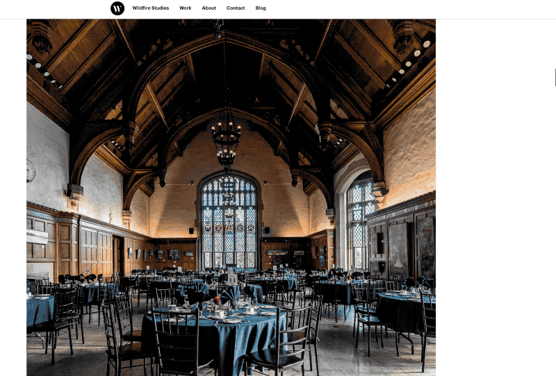
Behind the scenes of a photo heavy case study
First things first: there’s a new project in my portfolio. The client is Wycliffe College, a seminary on the University of Toronto campus who hired me to be their official photographer for the 2019 – 2020 school year.
The case study is a photo-heavy page with a fresh, magazine-inspired gallery design and loads of animations. When I say it’s photo-heavy, I’m not joking: there are 36 images in the main body of the page, and nearly 40 images if you include the “Related Projects” footer, website logo, and favicons.
Here’s a sped-up, low-res .gif of what it looked like before the design update. As you can see, the images are static, perfectly centred, and mildly boring to scroll.

And here’s what it looks like today (again, as a low-resolution and sped-up .gif). This design is more fun to look at and more fun to scroll — although images are larger, and scrolling takes longer as a result.
(To check it out in its high-resolution glory, simply visit the case study on the biggest screen you have.)
I’m really pleased with how this case study has turned out.
Of course, you can’t just throw three dozen high-resolution images on a website and call it a day. That was the first thing I tried, and it was immediately obvious that my new portfolio was ill-suited for displaying photos. I wanted photo grids, and instead I got a plain, vertical list of photo after photo.
I figured I had to make three things happen before I could share this in front of the world:
- A fresh design, especially on large screens. Scrolling through a long list of photos that perfectly line up with each other is kind of boring.
- Animations. Scrolling through a list of static images felt lifeless immediately. The obvious answer is to animate them, to keep them interesting.
- Finally, it takes a lot of bandwidth to quickly load that many images. So you need a way to cache them, and a way to load them only when they’re needed — just before they’re visible on screen. My website already does this, but there was obvious room for improvement.
I thought it fun to share how I solved all these problems.
A fresh design
The fresh design was the last thing to come together, even though it’s the first thing on the list. I started by adding different image sizes and galleries, but, when I started testing the case study, it became clear that wouldn’t be enough.
Eventually, the problem became clear to me. On large screens (like, 13” laptops and beyond), there was a lot of space to the left of the images. It felt like the margins were too large, and I’d missed an opportunity.
Fixing that was easy. I added a “left-aligned” CSS class to images and galleries that I wanted to hang to the left. (I added this to the backend of the site, so I could do it on the fly. This was easy in Craft, and would still be relatively simple in many other CMSes. But you could very easily just do it in raw HTML.)
The left-aligned code is pretty simple. Here’s my SCSS code, if you’re interested:
.image-grids.wide.left-aligned, figure.wide.left-aligned {
	@media screen and (min-width:1400px){
		margin-right:calc((100vw - 1200px) / 2);
		// This is the inverse of the margin-left calc applies for regular .image-grids and wide right-aligned figures
		margin-left:0;
	}

	@media screen and (min-width:2000px){
		margin-left:calc(((100vw - 1200px) / 2) - 367px);
		// line up the images on the grid. This looks messy, but it calculates math based on the padding of image grids with three images in them.
	}
}
It just tells the browser to push some images further left than others. (Also, I use “calc” a lot, because CSS is basically just math. I’m sure there’s room for improvement here.)
This layout should be obvious if you’re on any laptop or desktop that is more than 1400px wide (For content: 13” MacBook Pros and MacBook Airs have defaulted to a higher resolution than this for years, but most iPads are still not this high-resolution.)
Animating images and elements
The new design doesn’t solve everything on its own. Even though this is just a long list of static images, it needed some sort of motion to come to life. So it was time to animate the images.
I know a few people who say you should make all your own CSS animations. I think you should know how to write key frames, but for the most part, a decent animation library will get you there.
I really like Animate on Scroll (AOS). AOS is clever: it uses vanilla Javascript instead of jQuery (which I love), you have an enormous amount of control, and you can easily code your own animations if you need to. It’s also pretty lightweight. Oh, and the animations trigger only once the animated element appears in the browser viewport.
Adding AOS to your site is as easy as you’d expect: add the script, init the library in the <footer> of your document, and add the CSS to your working files. But you can really optimize it for performance.
I load the library and initiate the script only on the pages that require it. I’ve also adjusted the script initiation, so animations only begin after my images have loaded (and not on page load). If you’re curious, here’s what my configuration looks like:
AOS.init({
	  // Global settings:
	  disable: false, // accepts following values: 'phone', 'tablet', 'mobile', boolean, expression or function
	  startEvent: 'lazybeforeunveil', // name of the event dispatched on the document, that AOS should initialize on
	  initClassName: 'aos-init', // class applied after initialization
	  animatedClassName: 'aos-animate', // class applied on animation
	  useClassNames: false, // if true, will add content of `data-aos` as classes on scroll
	  disableMutationObserver: false, // disables automatic mutations' detections (advanced)
	  debounceDelay: 50, // the delay on debounce used while resizing window (advanced)
	  throttleDelay: 99, // the delay on throttle used while scrolling the page (advanced)

	  // Settings that can be overridden on per-element basis, by `data-aos-*` attributes:
	  offset: 120, // offset (in px) from the original trigger point
	  delay: 0, // values from 0 to 3000, with step 50ms
	  duration: 1000, // values from 0 to 3000, with step 50ms
	  easing: 'ease', // default easing for AOS animations
	  once: false, // whether animation should happen only once - while scrolling down
	  mirror: false, // whether elements should animate out while scrolling past them
	  anchorPlacement: 'top-bottom', // defines which position of the element regarding to window should trigger the animation
});
Most of these settings are default, but the key change I made was to the startEvent. Typically, the start event is DOMContentLoaded, which loads animations as soon as the page is done loading. That was too soon for me. lazybeforeunveil is the event that my lazy loading plugin declares just before loading images into the viewport. Not only did this speed up page load times, but using lazybeforeunveil instead of DOMContentLoaded made scrolling feel much more responsive.
I’ve added animations to most of the images on my portfolio. You can see them in action in the new case study. AOS is such a nice library that I plan to use it on every project that calls for animations in the future.
Optimizing and lazy loading images
My website has optimized images with <scrset> for years, but I ran into a bug with my particular setup. For whatever reason, browsers would load images before they should. (I verified this by using the Network tool in Chrome, Safari, and Firefox, so it wasn’t just a browser bug.) At page load, instead of loading just the hero image, small versions of every image would get loaded before the DOM was visible. I had to fix this bug before putting up a photographic case study.
My portfolio was the first site I built with Craft. One of the things I love about Craft is the way it handles images: you can declare a focal point, resize and crop images on the fly, and create vastly different looking templates based on media queries and <picture> tags.
To make all this happen, I use a plugin called Imager by André Elvan. Imager generally makes this easy to use and accessible within your Craft templates. If you’re like me, and you need to follow a guide to get started, Andrew Welch wrote one that I found incredibly handy.
Andrew guides you (no pun intended) through the basics, and also teaches you how to set up basic lazy loading (with lazysizes, which I’ve quite liked). The problem is that, as of late 2019/early 2020, the image source tag in that demo doesn’t work properly out of the box.
Here’s the sample code from Andrew Welch:
<img class="scale-with-grid lazyload"
     src="{{ craft.imager.base64Pixel(2,1) }}"
     data-sizes="100vw"
     data-srcset="{{ craft.imager.srcset(transformedImages) }}"
     alt="{{ image.title }}">
Here’s are the things unique to my setup in this code:
- The
lazyloadclass initiates lazysizes.js. craft.imageer.srcset(transformedImages)fetches an array of images I had transformed with Imager. This just means I can automate asset creation in Craft, which is handy for dynamic image sizes.craft.imager.base64Pixel(2,1)is creating an SVG that’s 2 pixels wide and 1 pixel tall.
Here was my problem: craft.imager.bas64Pixel(2,1) wasn’t creating an SVG. Which is why the browsers were (helpfully) grabbing images from srcset on page load.
After a lot of trial and error, I carefully read through the README file on Github for Imager.1 It turns out that base64(width,height) is deprecated. There was a new function that I needed to use in its place: placeholder(width,height). (Width and height can be whatever values you want, but as you’ll see, you can get clever with it.)
Using the same example variables as above, the new code looks something like this:
<img class="lazyload"
	src="{{ craft.imager.placeholder({
		width: transformedImages[1].width,
		height: transformedImages[1].height
	}) }}"
	data-sizes="100vw"
	data-srcset="{{ craft.imager.srcset(transformedImages) }}" />
That placeholder line is actually doing some very cool stuff. The transparent SVG it generates is the same height and width as the image it’s lazy loading. This prevents any scroll jankiness that might occur as the reader scrolls up and down, since image placeholders are the same size as the images themselves.
This, combined with the caching I have set up on Craft, makes the website blazingly fast — even faster than it already was (and it was pretty quick). The new case study, which has over 10mb of images on it, loads in less than a second.2
(As an aside: this new code helped me optimize the website and remove three other template files for galleries and images. I love this. There’s nothing better than deleting files.)
If any of this piqued your interest, I’d love it if you checked out the photos or visited my portfolio.
Footnotes
-
I am aware I should have done this first. We all make mistakes. Please forgive me for this one. ↩︎
-
There is one point of failure still, but it seems like that’s a bug with Flickity, my image slider of choice. I’m still sorting through that bug. After a series of Flickity bugs related to iOS 13 and Firefox, I don’t think I’ll be using it as much in the future. ↩︎
January 15, 2020
The rock and the hard place for Wordpress
Let’s imagine you want to start blogging, or need to make a small website. Where do you start?
For many years, the default recommendation was WordPress. It was “easy to install,” “easy to update,” and “easy to use” for people who weren’t familiar with CMS technology. But I’m not sure this is true anymore, and I no longer recommend WordPress to clients.
If you’re not a developer, WordPress is not where you should start with your website. You would be better served by Squarespace, Ghost, et al. Squarespace lets you design an entire website with drag and drop features, and Ghost lets you start blogging with beautiful themes and a premium hosted service. There’s no need to install anything with either platform. And if you need to set up an online store, both Squarespace and Shopify will make your life much easier than WordPress and WooCommerce.
I’ve also noticed something else in the past couple years: WordPress is not easy to use. The backend is a monster, and Gutenberg has made it harder for my clients to use — not easier. Almost any other CMS I’ve tried has been easier for my clients to grasp than WordPress.
If you are technically proficient, it’s getting harder and harder to recommend WordPress. Thanks to Gutenberg and the increasing use of Rest APIs and Javascript, along with the old PHP core, developing for WordPress becomes more nightmarish seemingly with every passing week.
And if you have any opinions about web development at all, WordPress’s attempts to get you to code “the WordPress way” will frustrate or anger you, depending on your tolerance levels.
If you’re a modern PHP developer, you could use Bedrock to build WordPress, but it’s still WordPress. Bedrock doesn’t solve the problems that Gutenberg and the plugin architecture create. (Trust me: I built this blog with Bedrock, and as of January 2020, I plan on getting off WordPress as soon as possible.)
The problem is this: inevitably, nearly every WordPress site eventually becomes a mess of spaghetti code and plugins that make actually using the site impossible.
Developers (or technically-minded people) would be better off with almost any of the myriad CMSes that are available: Ghost, Craft, Kirby, Grav, Statamic, Shopify, and more are all typically easier to develop for than WordPress. (I haven’t even mentioned static generators.) The options are limitless.
All of this puts WordPress between a rock and a hard place. If developers and regular people should avoid it, who is it for?
I no longer have an answer.
December 13, 2019
Caching a Craft CMS site with Nginx
I recently wrapped up building my first client website with Craft CMS, and am very nearly ready to launch my new portfolio with the service as well. Craft is amazing, and completely blows away the competition for any sort of visually intensive website with complicated layouts.
That being said, one of the things I really like about the WordPress setup I use is my caching setup. I wanted something similar for Craft — something that doesn’t require a ton of work to set up or maintain.
This is largely based on Tim de Pater’s existing gist for WordPress caching, but customized to deal with Craft’s requirements. I’m also borrowing liberally from NYStudio107’s excellent article.
A couple things that are worth noting: I’m using Forge by Laravel, along with Linode, for my basic hosting needs. So some of this code will be related to that setup in particular. I’ve also removed some of this code for the sake of streamlining what you see here.
You’ll also need a Craft plugin to handle busting the cache whenever you update your site. I’m using FastCGI Cache Bust(once again from NYStudio107) to get it done, but if you wanted to write your own script or use somebody else’s plugin, I’m sure you could. (And if you’re a masochist who wants to SSH in every time you make a chance and bust the cache yourself, that’s between you and God.)
The only other thing you’ll need to do is bust the cache whenever you pull from git and run composer update on the server. I use a simple bash script for this, which you’ll find all over the web.
Everything you need to tweak in your Nginx config file should be visible below in ALL CAPS. This has been working seamlessly for me so far, and has been an even stronger solution than what I was doing for my WordPress sites.
fastcgi_cache_path /etc/nginx/cache/yourfolder/ levels=1:2 keys_zone=ZONENAME:100m inactive=60m;
fastcgi_cache_key "$scheme$request_method$host$request_uri";

server {
    listen 443 ssl http2;
    listen [::]:443 ssl http2;
    server_name YOURURL.com;
    root /home/forge/YOURURL.com/web;

    # Your SSL settings will go right here

    add_header X-Frame-Options "SAMEORIGIN";
    add_header X-XSS-Protection "1; mode=block";
    add_header X-Content-Type-Options "nosniff";

    index index.html index.htm index.php;

    charset utf-8;

    location / {
        try_files $uri $uri/ /index.php?$query_string;
    }

    # Directives to send expires headers and turn off 404 error logging.
    location ~* ^.+\.(ogg|ogv|svg|svgz|eot|otf|woff|woff2|mp4|ttf|css|rss|atom|js|jpg|jpeg|gif|png|ico|zip|tgz|gz|rar|bz2|doc|xls|exe|ppt|tar|mid|midi|wav|bmp|rtf)$ {
           access_log off; log_not_found off; expires max;
    }

    location = /favicon.ico { access_log off; log_not_found off; }
    location = /robots.txt  { access_log off; log_not_found off; }

    access_log off;
    error_log  /var/log/nginx/YOURURL.com-error.log error;

    error_page 404 /index.php?$query_string;

    location ~ \.php$ {
        fastcgi_split_path_info ^(.+\.php)(/.+)$;
        fastcgi_pass unix:/var/run/php/php7.3-fpm.sock;
        fastcgi_index index.php;
        fastcgi_cache ZONENAME;
        fastcgi_cache_valid 200 1w;
        fastcgi_cache_bypass $no_cache;
        fastcgi_no_cache $no_cache;
        fastcgi_cache_use_stale updating error timeout invalid_header http_500;
        fastcgi_cache_lock on;
        fastcgi_ignore_headers Cache-Control Expires Set-Cookie;
        include fastcgi_params;
    }

    location ~ /\.(?!well-known).* {
        deny all;
    }

    # Troll WordPress bots/users
    location ~ ^/(wp-login|wp-admin|wp-config|wp-content|wp-includes|(.*)\.exe) {
        return 301 https://wordpress.com/wp-login.php;
    }

    #Cache everything by default
    set $no_cache 0;

    #Don't cache POST requests
    if ($request_method = POST)
    {
        set $no_cache 1;
    }

    #Don't cache if the URL contains a query string
    if ($query_string != "")
    {
        set $no_cache 1;
    }

    #Don't cache the following URLs
    if ($request_uri ~* "/(admin/|cpresources/)")
    {
        set $no_cache 1;
    }

    # Don't cache uris containing the following segments
    if ($request_uri ~* "/feed/|sitemap(_index)?.xml") {
        set $no_cache 1;
    }

}

# FORGE CONFIG (DO NOT REMOVE!)
include forge-conf/YOURURL.com/after/*;
Side note: I’ve been building websites professionally for close to a decade now, and this is the first time I’ve ever included a snippet of code on my blog. I’ll have to do this more often.