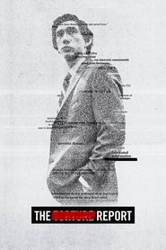
Why was so much of this shot handheld? It’s so distracting. Every flashback is scorched in sepia, which is also distracting. I kept thinking the white balance was wrong, but nope, it’s just style interfering with substance. And what’s with the title cards screaming the year at us? Felt like a bad made-for-TV movie.
Not to mention the fact that these flashbacks distract from Dan’s story. I wanted this to feel more like Spotlight or All The President’s Men, and less like Zero Dark Thirty’s opposite day.
Produced by Soderbergh, but plays more like Soderbergh Jr, and I really didn’t like it.
