I’m super late to the party on this, but I’m a huge fan of Klim’s new(-ish) typeface, Söhne, as well as their amazing new website. Really, really clever website, and the face looks gorgeous.
Posts about Design
January 07, 2020
Things I like: Söhne and the new Klim Type website
September 11, 2018
How to design a better portfolio
About a week ago on Twitter, I asked a poorly phrased question, which I’ll re-phrase here for clarity’s sake:
Why do designers focus on images in their portfolio’s archive, instead of properly describing their work?
This is something I’m just as guilty of as the next designer. Here’s an image of what my portfolio looked like at the time of the tweet. You can find countless other design portfolios that riff on a theme just like this.

My favourite portfolios are really image-heavy, and I suspect that’s true for most people. Those portfolios are so fun to look at and make. But I often find myself wondering if those portfolios are effective.
If you’re a potential client, why would you click on a thumbnail image? Some designers might hope that the thumbnail tells the story of their project, but the thumbnail is inconclusive at best and misleading at its worst. It often shows off what the final result looks like, but it doesn’t share the thinking behind that visual approach.
But that’s what designers should sell. We need to sell the thought process that gets clients results, because that’s what a good designer gets paid for.
Design pricing is in a race to the bottom. Or maybe it’s already bottomed out. But I think a lot of that is because we’re showing off visuals, instead of explaining our process or discussing our results.
So I’ve made some changes to my portfolio. Now, when you visit the home page, you’ll see a list of every project I was proud to be a part of. Instead of images, each project gets a description. Some of those descriptions link to case studies, and some don’t — but the work is all present and explained.
I had a lot of fun making this. My portfolio isn’t as flashy as it was before, but I hope my portfolio will now be more effective.
January 04, 2017
Good design is a fight
If you’re a designer who works with clients on a regular basis, it’s easy to be exhausted. Working with clients is hard! I’ve seen many designers, myself included, shake their heads in despair at client requests. I’ve also seen a lot of designers give up fighting them.
But you can’t. The fight is what leads to good design. Good design is a fight.
I’ve known one of my current clients for years now — probably getting close to half a decade. They’re a great crew, and the boss is a fantastic guy to work for. But we got into a few arguments on the most recent project that ended with me apologizing for the ruckus once the whole thing was over.
The client simply said this: “it’s okay. Arguing is part of good work.”
If you want to design something of value, you’re inevitably going to upset people. Design is saying no to a thousand ideas so you can say yes to one good one. That naturally leads to arguments.
But don’t be disheartened: the best designers, in the world’s most desirable companies, fight every day. It’s a fight to make something worthwhile. But it’s a fight you can win.
November 04, 2016
Awesome design alert: the Helsinki Philharmonic Orchestra
I’ve been meaning to talk about the new brand identity of the Helsinki Philharmonic Orchestra for a while. This is absolutely wicked stuff from Bond Agency, a top-notch graphic design studio.

A few years ago, I did the design work for a music magazine called The Modern Producer. (I should really put that case study back up on the website; it was great.) One of the things I had fun with was the idea of using a waveform in the logo. The branding for the Helsinki Philharmonic Orchestra takes that idea so much further. I absolutely adore it.

I also love the motion that they bring into this identity. It all comes together beautifully, with clean typography and a real sense of energy. I get the feeling convincing people that seeing an orchestra is energetic is a tough sell, and this branding absolute nails it. I love every bit of it.
The branding for the Helsinki Philharmonic Orchestra is one of the year’s bests, folks. Check it out in all its glorious detail over at Bond Agency’s website. And Bond, if you’re reading this, much respect to you for this incredibly inspiring work.
September 26, 2016
Cooper Hewitt
One of the projects I’m working on is an identity project for a new Canadian charity. I’ve been trying to find a typeface that’s legible and distinctive, particularly in the regions of the world where they’ll be sending volunteers. I’ve found myself entranced by Cooper Hewitt’s typeface, which is open source and available for unrestricted public use.
In researching the typeface, I stumbled onto Pentagram’s new-ish case study about the project. It’s a very long read, but so incredibly insightful. In truth, I haven’t finished reading it yet. But the case study’s awesome, and I couldn’t wait to share it.
September 13, 2016
Minimalism
Most of my clients start talking about the sort of design work they’re looking for and use the word “minimalism”. Almost every time, they mean simplicity. But they’ve heard a lot of designers talk about minimalism in the past few years and think it’s going to unlock some hidden green valley of successful business heretofore unwitnessed by mankind.
Great designers talk about minimalism all the time. Dieter Rams, of Braun fame, spoke frequently about using minimalism to remove layers of abstraction from his industrial design. Jony Ive speaks eloquently about minimalism whenever he narrates a new iPhone video for Apple. Recent Microsoft hire Andrew Kim used the term in a (now missing) blog post on his website to discuss his affection for the Xbox One S’s new design language.
I think minimalism has a bad end game, though.
Minimalism leads us to the sort of “invisible” hardware and difficult software in films like Minority Report. I’ll be the first to say that Minority Report has some of the cooled computers ever. But every computer in the film looks completely unusable — like trying to open a coconut with a fingernail.
Minimalism is all about the removal of features in an effort to achieve a zen-like product. It’s a philosophy more than a design mandate. And almost every hardware feature removed from a product gets added back into its software, which is why your phone feels increasingly complicated every year.
I get it. I get that it’s the way things are going. But as designers, we should be aiming higher.
Our goal should be to make usable products. If we want to delight people, we should be serving them with design. This applies to client services too. Clients come to us for our expertise, and our rationale — particularly the rationale of UX/digital designers — should lean towards anti-minimalism. Human-centred design is decidedly anti-minimalist.
Most of us aren’t minimalists. We like our creature comforts.
Minimalism is about clarity and simplicity. I believe in clear, purposeful design. But I don’t think minimalism is the only way, or even the most responsible way, to get there.
March 16, 2016
Blue and orange
I’ve read a lot of articles about how homogenous web design has become, but few have compelled me like Morgane Santos’ on Medium. For the first time, I felt as a web designer that I wanted to join this conversation.
This part of the article grabbed my attention:
Perhaps the biggest issue with all this homogeneity is how lonely it can feel when you want to do something different. Two separate friends have told me how they don’t feel like they fit in with the design community. These two friends are guys who more or less fit the Designer Dave stereotype, too. If they feel isolated, how does everyone else feel?
I started to gather my thoughts, but explained to my wife later on that I didn’t feel qualified to share them — which is interesting to me because it proves Ms. Santos’ theory. I, too, am white and in my mid-twenties (although I do not have a beard). Some of my web design work falls prey to certain stereotypes (although I don’t necessarily feel all of it does). In many ways, I relate to Designer Dave. With that being said, I’ve tried to gather my thoughts coherently regardless.
What’s happening in design reminds me of what’s been happening in filmmaking over the past twenty years. Have you noticed that a lot of popular action movies have been bathed in orange and blue?
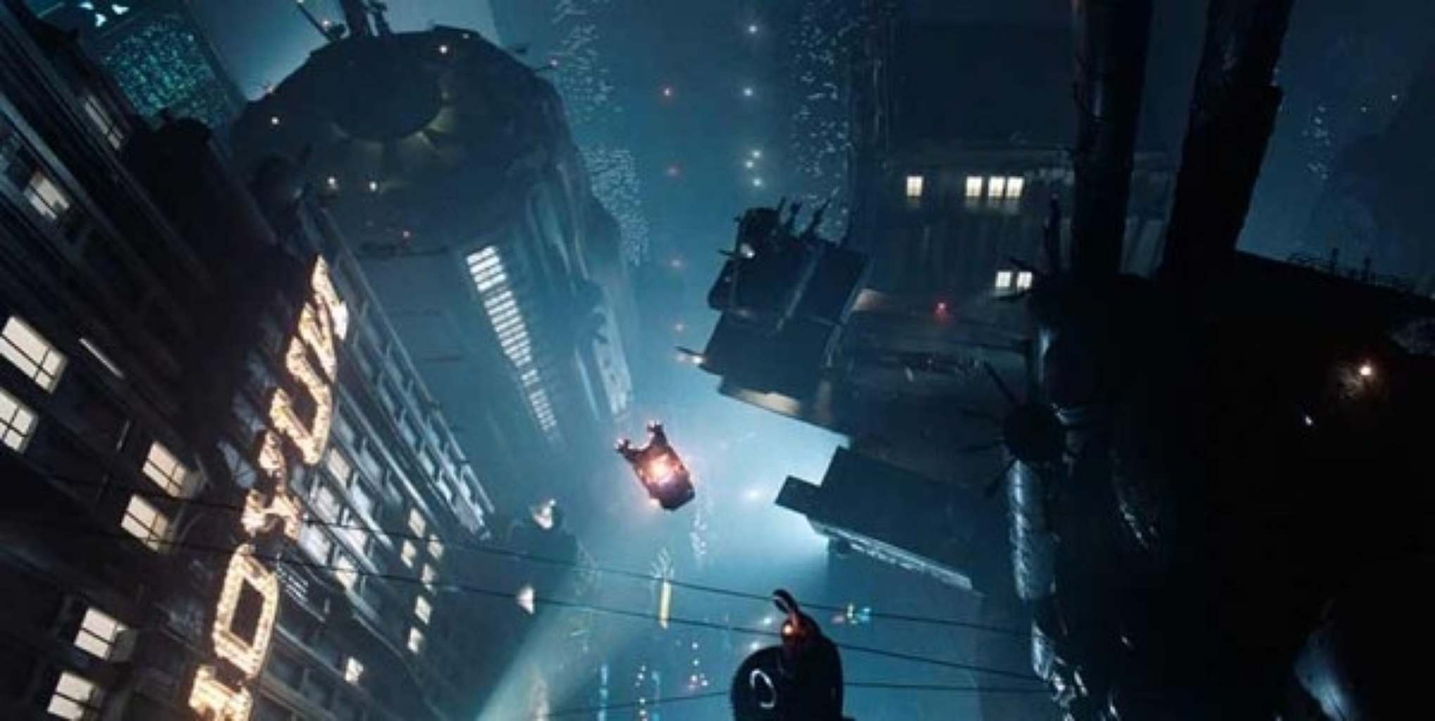

Once you see it, it’s hard to un-see it. Priceonomics has a really good rundown on what’s going on, and you should read the whole article, but this quote deserves special mention:
One way to figure out what will look good is to figure out what the common denominator is in the majority of your scenes. And it turns out that actors are in most scenes. And actors are usually human. And humans are orange, at least sort of! Most skin tones fall somewhere between pale peach and dark, dark brown, leaving them squarely in the orange segment of any color wheel. Blue and cyan are squarely on the opposite side of the wheel. You may remember from preschool that “opposite” color pairs like this are also known as “complementary” colors. That means that, side-by-side, they produce greater contrast than either would with any other color. And when we’re talking about color, contrast is generally a desirable thing.
I’d need to do more research, but I’d be willing to wager that a teal and orange colour scheme makes your average film studio more money on opening weekend too. Most big-budgets films are cast in this orange and blue look, while indies feel more free to roam around.
That’s not very different from web design: while market forces are unwilling to invest in unusual design, smaller organizations who need to stand out may be more interested. The same way some directors make one for the studio, and then one for them, it’s financially sensible to do the same thing as a designer. (I’m not saying to compromise your values; I’m telling you to make enough money to support yourself and your families.)
My second thought is this: there are ways to play with established conventions.
Priceonomics included an image from Mad Max: Fury Road in their article. It was my second-favourite movie last year, and a big part of that was because I adored the colours. The story is that director George Miller wanted to show the film in black and white, but Warner Bros. refused (market forces at work). In response, Miller gave them what they wanted: blue and orange, cranked up as high as he could make it go.

That sense of over-saturation practically outdoes Transformers, and in a backhand way, forces you to notice it and be aware. I don’t know a single person who saw it who didn’t mention the colours. It’s subversive. Miller wants the colours to be part of the film’s intensity, yes, but he also wants it to reflect the insanity of everything else going on. It’s absolutely intentional.
I think we can learn something from Miller: If you’re given constraints that you don’t like, be subversive with them. We design for audiences who are smart enough to notice, and while they might not realize you’re being playful, they’ll appreciate your work all the more. You’ll stand out within the confines of homogeneity.
All that being said, at the end of the day, I don’t know the answer to homogeneity in web design, nor do I feel qualified to share my thoughts on the topic. For me, sharing this takes courage.
I learned in school that our brains are wired to notice semiotic patterns. Blue and orange is one such pattern. Boring websites are another. And while neither are going away any time soon, I think there’s a lot we can do to subvert expectations and experiment with new things.
September 15, 2015
Adrian Frutiger passes away
Incredibly sad news. Frutiger is responsible for a great many beautiful typefaces, but Univers is one of my favourites. For lack of better terms, a gentleman’s Helvetica. Rest in peace.