I find I typically learn about new-to-me CSS when I’m struggling through a problem. Today’s issue is an age-old problem I have with flexbox and grid approaches to layout design.
Consider a client using your average CMS to insert your standard unordered list. Maybe it looks like this:
<p>Here is a list of books we'd recommend on the topic:</p>

<ul>
    <li><em>Book One</em></li>
    <li><em>Book Two</em> (our go-to on the topic)</li>
    <li>And finally, <em>Book Three</em></li>
</ul>
Very simple HTML and CSS.
But let’s say the client wants to change the list design. In today’s example, they want to replace each bullet with a checkmark icon, and they want the checkmark to sit on a yellow circle. Ideally, these elements are accessible and scale with the type. So, you write this code:
ul.checklist {
	list-style: none;
	padding-left: 0;
	margin:0;
}

ul.checklist li {
	// Add white space
	margin: 1em 0 0;
	// Create a grid layout for your new icons
	display: grid;
	grid-template-columns: 1.5em auto;
	gap: .5em;
	max-width: 100%;
	// Not necessary, but habitual
	position: relative;
}

ul.checklist li::before, ul.checklist li::after {
	// Correctly size the icon and background
	grid-column:1;
	grid-row:1;
	height:1.5em;
	width:1.5em;
	content:'';
}

ul.checklist li::before {
	// Background yellow
	background: var(--color-yellow-100);
	border-radius: 50%;
}

ul.checklist li::after {
	// Add the icon
	// The mask changes the fill of the SVG
	background-color: var(--color-black-100);
	mask: url('/assets/icons/checkmark.svg') no-repeat center;
	mask-size: contain;
}
Before reading or scrolling any further, see if you can guess the problem that will arise from this layout. (If you guess it correctly, you are smarter than me, because I always forget this is going to happen.)
Ready? OK, here’s a screenshot of where this breaks down in real-world use on a non-profit’s website:
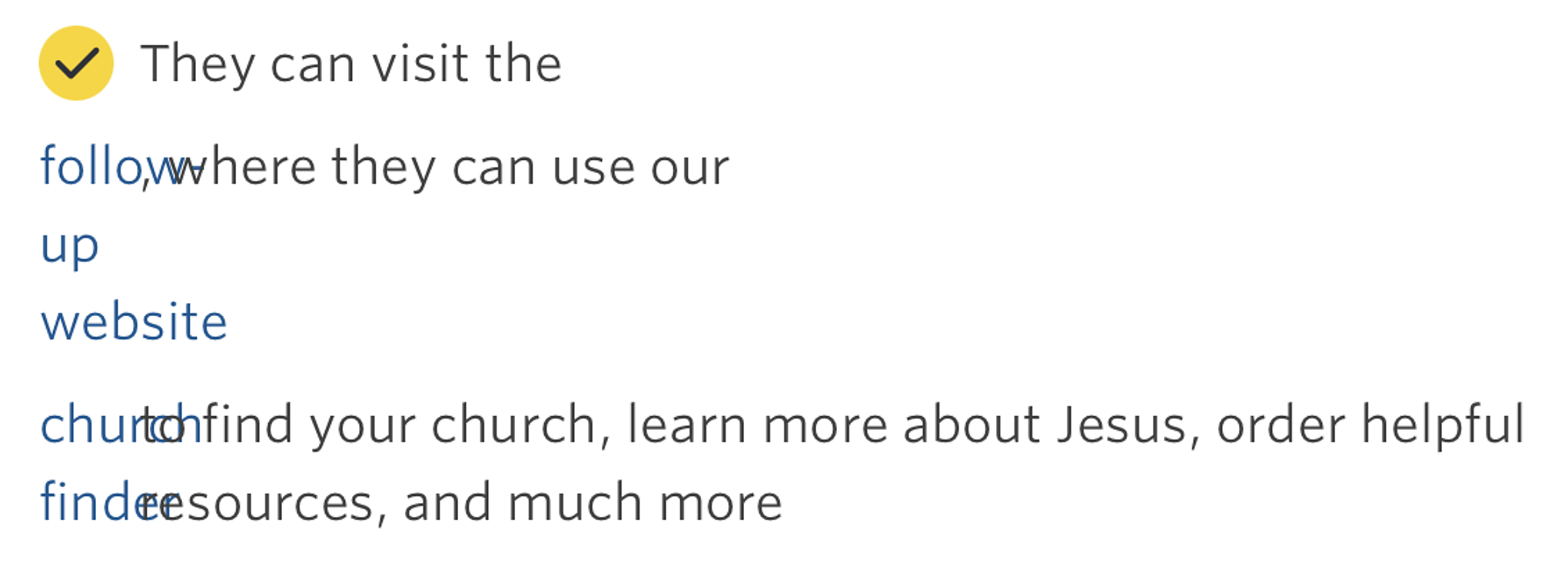
Basically, as far as the browser is concerned, each element in this <li> lines up with another column in the grid. So if the text in the <li> says Visit <a href="https://acme.co">our website</a> to learn more, that’s actually three elements (two text elements, one link element), and thus we have multiple column breaks.
The fix is easy:
li {
	display:contents;
}
I somehow missed the early writing about display:contents;, but there is very little written about this CSS feature anywhere, and it’s a handy one to know.
display:contents; is meant for use within flexbox or grid systems where child HTML elements like this break the flow of content. It’s support is decent (barring some tag-specific incompatibility). Its one downfall is that it breaks screen reader support; my understanding is that formatting is not read via screen readers when display:contents; is in use. (I am not positive this is accurate, but the situation used to be worse, and overall it seems fine today.)
To account for edge cases and be as specific as possible within a variety of CMSs, my new boilerplate for this (within a grid system) looks like this:
// Do not apply display:contents to paragraph tags inside li
ul.checklist li p {
	grid-column:2;
}

/**
 * For text inside an li that is not inside a p tag,
 * I want to support specific text formatting without breaking the grid.
 * This includes italics, bold, links, and code.
 * It does not include headings or anything else that might
 * break the intended purpose of the design.
**/
ul.checklist li > a, ul.checklist li > strong, ul.checklist li > b, ul,.checklist li > i, ul.checklist li > em, ul.checklist li > code {
	display:contents
}
And just like that, you have child elements in a grid container with inline formatting that doesn’t break the flow of their parent.
Here’s how that checkbox looks with the above code applied:
