First things first: there’s a new project in my portfolio. The client is Wycliffe College, a seminary on the University of Toronto campus who hired me to be their official photographer for the 2019 – 2020 school year.
The case study is a photo-heavy page with a fresh, magazine-inspired gallery design and loads of animations. When I say it’s photo-heavy, I’m not joking: there are 36 images in the main body of the page, and nearly 40 images if you include the “Related Projects” footer, website logo, and favicons.
Here’s a sped-up, low-res .gif of what it looked like before the design update. As you can see, the images are static, perfectly centred, and mildly boring to scroll.
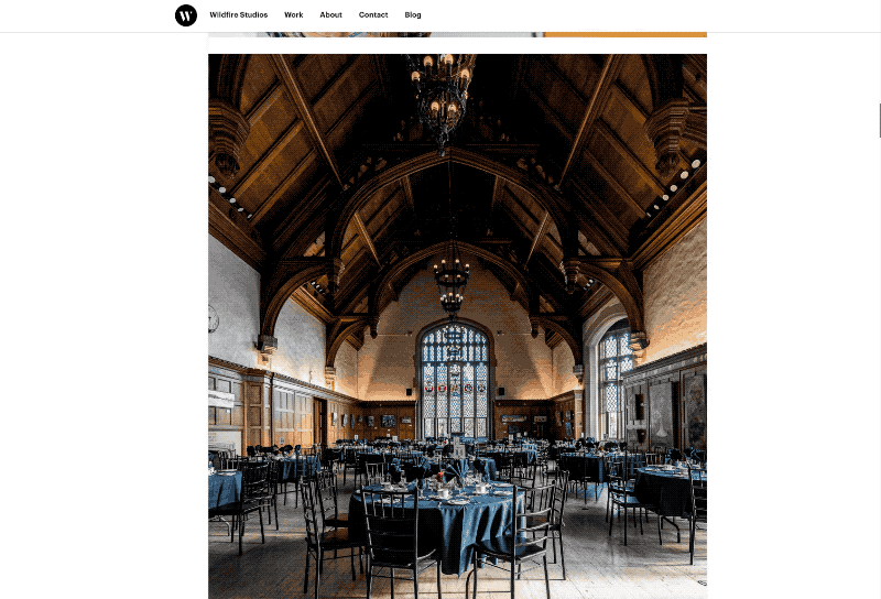
And here’s what it looks like today (again, as a low-resolution and sped-up .gif). This design is more fun to look at and more fun to scroll — although images are larger, and scrolling takes longer as a result.
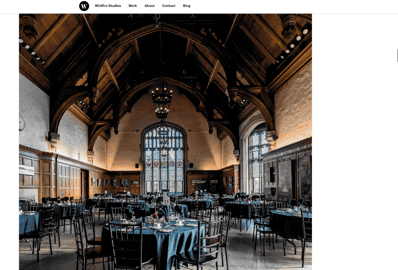
(To check it out in its high-resolution glory, simply visit the case study on the biggest screen you have.)
I’m really pleased with how this case study has turned out.
Of course, you can’t just throw three dozen high-resolution images on a website and call it a day. That was the first thing I tried, and it was immediately obvious that my new portfolio was ill-suited for displaying photos. I wanted photo grids, and instead I got a plain, vertical list of photo after photo.
I figured I had to make three things happen before I could share this in front of the world:
- A fresh design, especially on large screens. Scrolling through a long list of photos that perfectly line up with each other is kind of boring.
- Animations. Scrolling through a list of static images felt lifeless immediately. The obvious answer is to animate them, to keep them interesting.
- Finally, it takes a lot of bandwidth to quickly load that many images. So you need a way to cache them, and a way to load them only when they’re needed — just before they’re visible on screen. My website already does this, but there was obvious room for improvement.
I thought it fun to share how I solved all these problems.
A fresh design
The fresh design was the last thing to come together, even though it’s the first thing on the list. I started by adding different image sizes and galleries, but, when I started testing the case study, it became clear that wouldn’t be enough.
Eventually, the problem became clear to me. On large screens (like, 13” laptops and beyond), there was a lot of space to the left of the images. It felt like the margins were too large, and I’d missed an opportunity.
Fixing that was easy. I added a “left-aligned” CSS class to images and galleries that I wanted to hang to the left. (I added this to the backend of the site, so I could do it on the fly. This was easy in Craft, and would still be relatively simple in many other CMSes. But you could very easily just do it in raw HTML.)
The left-aligned code is pretty simple. Here’s my SCSS code, if you’re interested:
.image-grids.wide.left-aligned, figure.wide.left-aligned {
	@media screen and (min-width:1400px){
		margin-right:calc((100vw - 1200px) / 2);
		// This is the inverse of the margin-left calc applies for regular .image-grids and wide right-aligned figures
		margin-left:0;
	}

	@media screen and (min-width:2000px){
		margin-left:calc(((100vw - 1200px) / 2) - 367px);
		// line up the images on the grid. This looks messy, but it calculates math based on the padding of image grids with three images in them.
	}
}
It just tells the browser to push some images further left than others. (Also, I use “calc” a lot, because CSS is basically just math. I’m sure there’s room for improvement here.)
This layout should be obvious if you’re on any laptop or desktop that is more than 1400px wide (For content: 13” MacBook Pros and MacBook Airs have defaulted to a higher resolution than this for years, but most iPads are still not this high-resolution.)
Animating images and elements
The new design doesn’t solve everything on its own. Even though this is just a long list of static images, it needed some sort of motion to come to life. So it was time to animate the images.
I know a few people who say you should make all your own CSS animations. I think you should know how to write key frames, but for the most part, a decent animation library will get you there.
I really like Animate on Scroll (AOS). AOS is clever: it uses vanilla Javascript instead of jQuery (which I love), you have an enormous amount of control, and you can easily code your own animations if you need to. It’s also pretty lightweight. Oh, and the animations trigger only once the animated element appears in the browser viewport.
Adding AOS to your site is as easy as you’d expect: add the script, init the library in the <footer> of your document, and add the CSS to your working files. But you can really optimize it for performance.
I load the library and initiate the script only on the pages that require it. I’ve also adjusted the script initiation, so animations only begin after my images have loaded (and not on page load). If you’re curious, here’s what my configuration looks like:
AOS.init({
	  // Global settings:
	  disable: false, // accepts following values: 'phone', 'tablet', 'mobile', boolean, expression or function
	  startEvent: 'lazybeforeunveil', // name of the event dispatched on the document, that AOS should initialize on
	  initClassName: 'aos-init', // class applied after initialization
	  animatedClassName: 'aos-animate', // class applied on animation
	  useClassNames: false, // if true, will add content of `data-aos` as classes on scroll
	  disableMutationObserver: false, // disables automatic mutations' detections (advanced)
	  debounceDelay: 50, // the delay on debounce used while resizing window (advanced)
	  throttleDelay: 99, // the delay on throttle used while scrolling the page (advanced)

	  // Settings that can be overridden on per-element basis, by `data-aos-*` attributes:
	  offset: 120, // offset (in px) from the original trigger point
	  delay: 0, // values from 0 to 3000, with step 50ms
	  duration: 1000, // values from 0 to 3000, with step 50ms
	  easing: 'ease', // default easing for AOS animations
	  once: false, // whether animation should happen only once - while scrolling down
	  mirror: false, // whether elements should animate out while scrolling past them
	  anchorPlacement: 'top-bottom', // defines which position of the element regarding to window should trigger the animation
});
Most of these settings are default, but the key change I made was to the startEvent. Typically, the start event is DOMContentLoaded, which loads animations as soon as the page is done loading. That was too soon for me. lazybeforeunveil is the event that my lazy loading plugin declares just before loading images into the viewport. Not only did this speed up page load times, but using lazybeforeunveil instead of DOMContentLoaded made scrolling feel much more responsive.
I’ve added animations to most of the images on my portfolio. You can see them in action in the new case study. AOS is such a nice library that I plan to use it on every project that calls for animations in the future.
Optimizing and lazy loading images
My website has optimized images with <scrset> for years, but I ran into a bug with my particular setup. For whatever reason, browsers would load images before they should. (I verified this by using the Network tool in Chrome, Safari, and Firefox, so it wasn’t just a browser bug.) At page load, instead of loading just the hero image, small versions of every image would get loaded before the DOM was visible. I had to fix this bug before putting up a photographic case study.
My portfolio was the first site I built with Craft. One of the things I love about Craft is the way it handles images: you can declare a focal point, resize and crop images on the fly, and create vastly different looking templates based on media queries and <picture> tags.
To make all this happen, I use a plugin called Imager by André Elvan. Imager generally makes this easy to use and accessible within your Craft templates. If you’re like me, and you need to follow a guide to get started, Andrew Welch wrote one that I found incredibly handy.
Andrew guides you (no pun intended) through the basics, and also teaches you how to set up basic lazy loading (with lazysizes, which I’ve quite liked). The problem is that, as of late 2019/early 2020, the image source tag in that demo doesn’t work properly out of the box.
Here’s the sample code from Andrew Welch:
<img class="scale-with-grid lazyload"
     src="{{ craft.imager.base64Pixel(2,1) }}"
     data-sizes="100vw"
     data-srcset="{{ craft.imager.srcset(transformedImages) }}"
     alt="{{ image.title }}">
Here’s are the things unique to my setup in this code:
- The
lazyloadclass initiates lazysizes.js. craft.imageer.srcset(transformedImages)fetches an array of images I had transformed with Imager. This just means I can automate asset creation in Craft, which is handy for dynamic image sizes.craft.imager.base64Pixel(2,1)is creating an SVG that’s 2 pixels wide and 1 pixel tall.
Here was my problem: craft.imager.bas64Pixel(2,1) wasn’t creating an SVG. Which is why the browsers were (helpfully) grabbing images from srcset on page load.
After a lot of trial and error, I carefully read through the README file on Github for Imager.1 It turns out that base64(width,height) is deprecated. There was a new function that I needed to use in its place: placeholder(width,height). (Width and height can be whatever values you want, but as you’ll see, you can get clever with it.)
Using the same example variables as above, the new code looks something like this:
<img class="lazyload"
	src="{{ craft.imager.placeholder({
		width: transformedImages[1].width,
		height: transformedImages[1].height
	}) }}"
	data-sizes="100vw"
	data-srcset="{{ craft.imager.srcset(transformedImages) }}" />
That placeholder line is actually doing some very cool stuff. The transparent SVG it generates is the same height and width as the image it’s lazy loading. This prevents any scroll jankiness that might occur as the reader scrolls up and down, since image placeholders are the same size as the images themselves.
This, combined with the caching I have set up on Craft, makes the website blazingly fast — even faster than it already was (and it was pretty quick). The new case study, which has over 10mb of images on it, loads in less than a second.2
(As an aside: this new code helped me optimize the website and remove three other template files for galleries and images. I love this. There’s nothing better than deleting files.)
If any of this piqued your interest, I’d love it if you checked out the photos or visited my portfolio.
-
I am aware I should have done this first. We all make mistakes. Please forgive me for this one. ↩︎
-
There is one point of failure still, but it seems like that’s a bug with Flickity, my image slider of choice. I’m still sorting through that bug. After a series of Flickity bugs related to iOS 13 and Firefox, I don’t think I’ll be using it as much in the future. ↩︎